IRONBOOZT — Sustainable Sportswear Identity
The Core Challenge
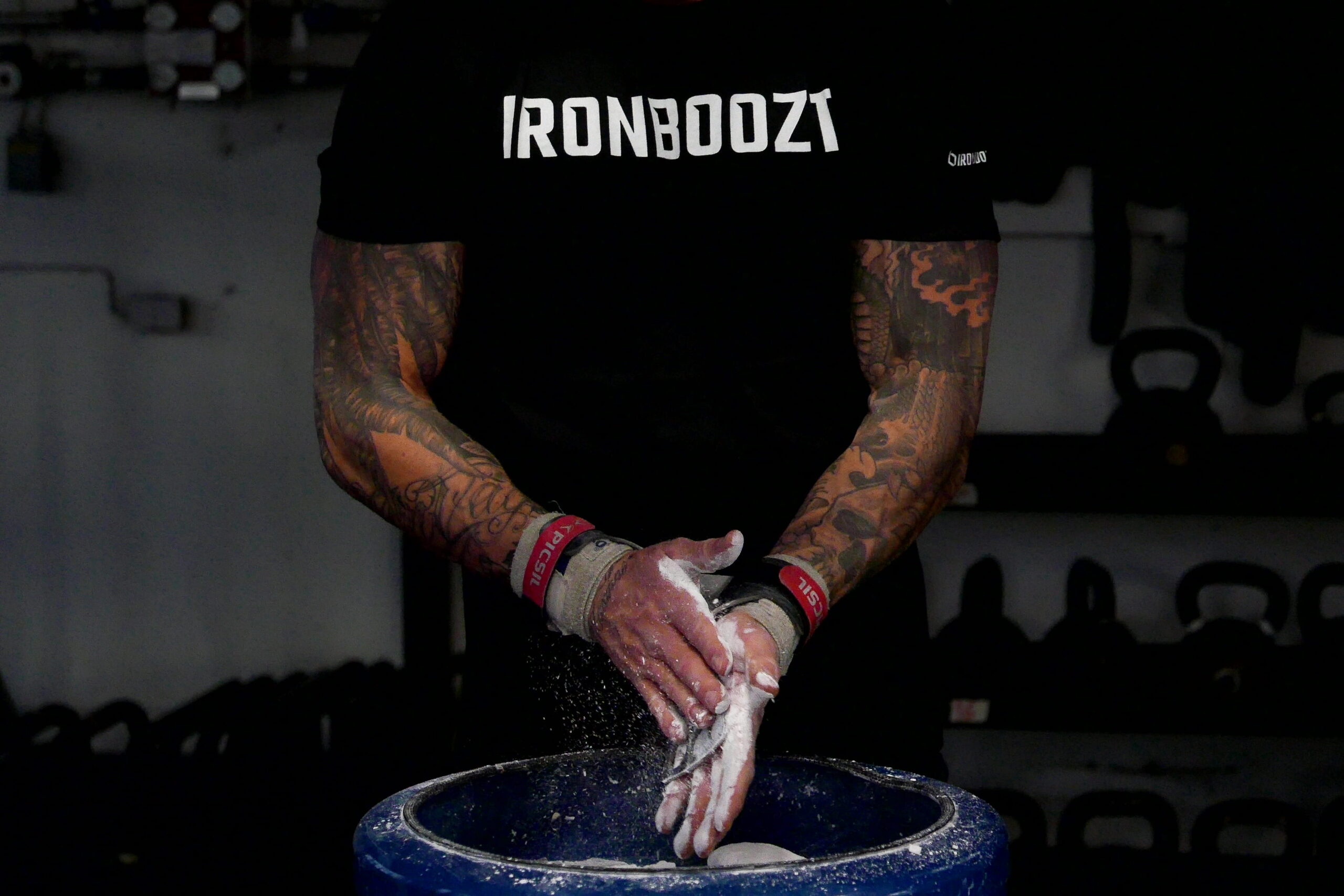
Ironboozt entered the fitness apparel space with a focus on local Swedish production and sustainable materials. The goal was to build a visually powerful identity that combined a raw fitness aesthetic with a sleek, premium product feel.
Design System & Brand Execution
Developing a clean monochrome visual identity tailored for fitness apparel and physical product packaging.
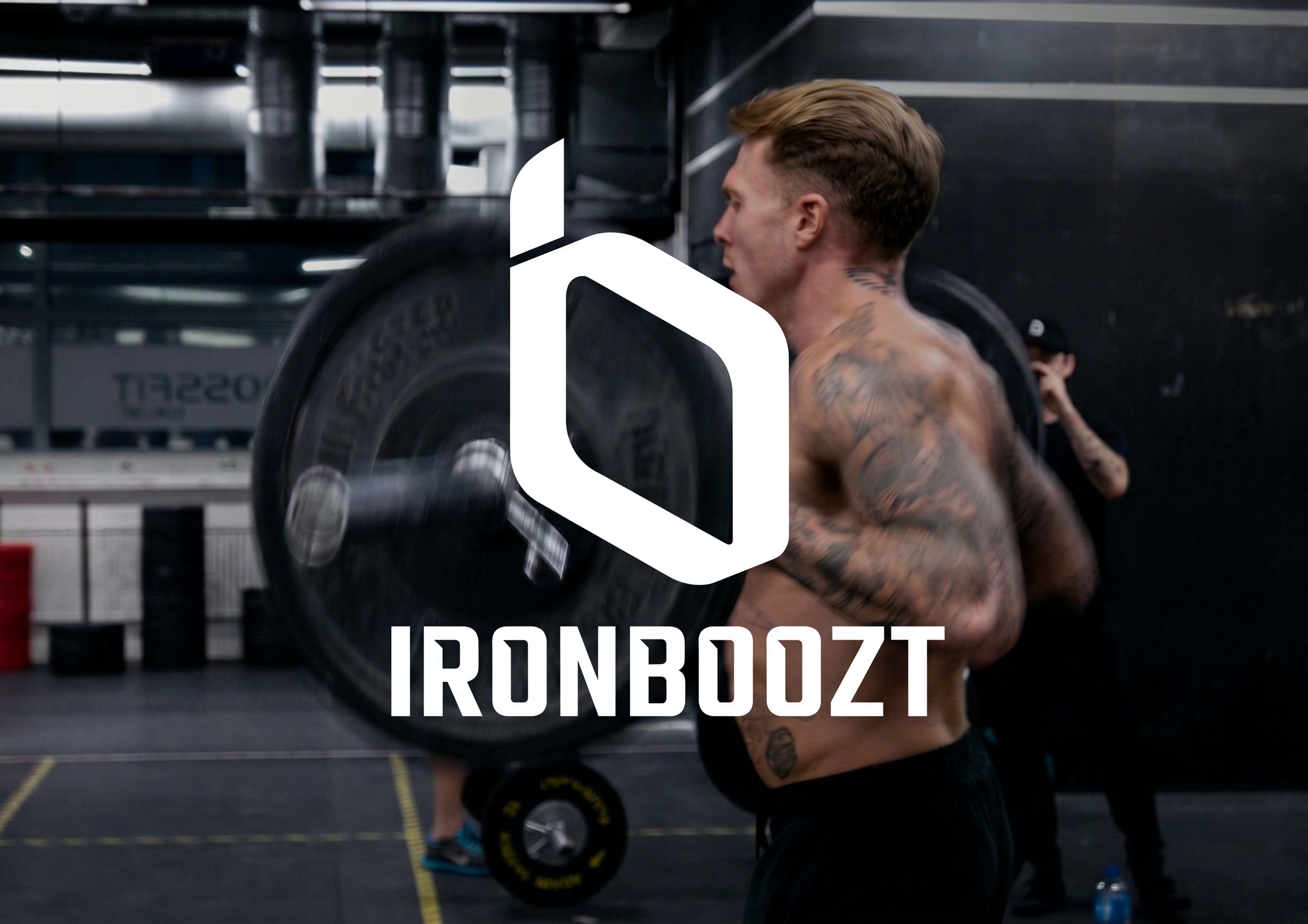
Integrated ‘i/b’ Monogram
Designed a geometric symbol fusing a lowercase ‘i’ and ‘b’ into a single mark, paired with solid typography for a strong visual identity on apparel.
Monochrome Palette
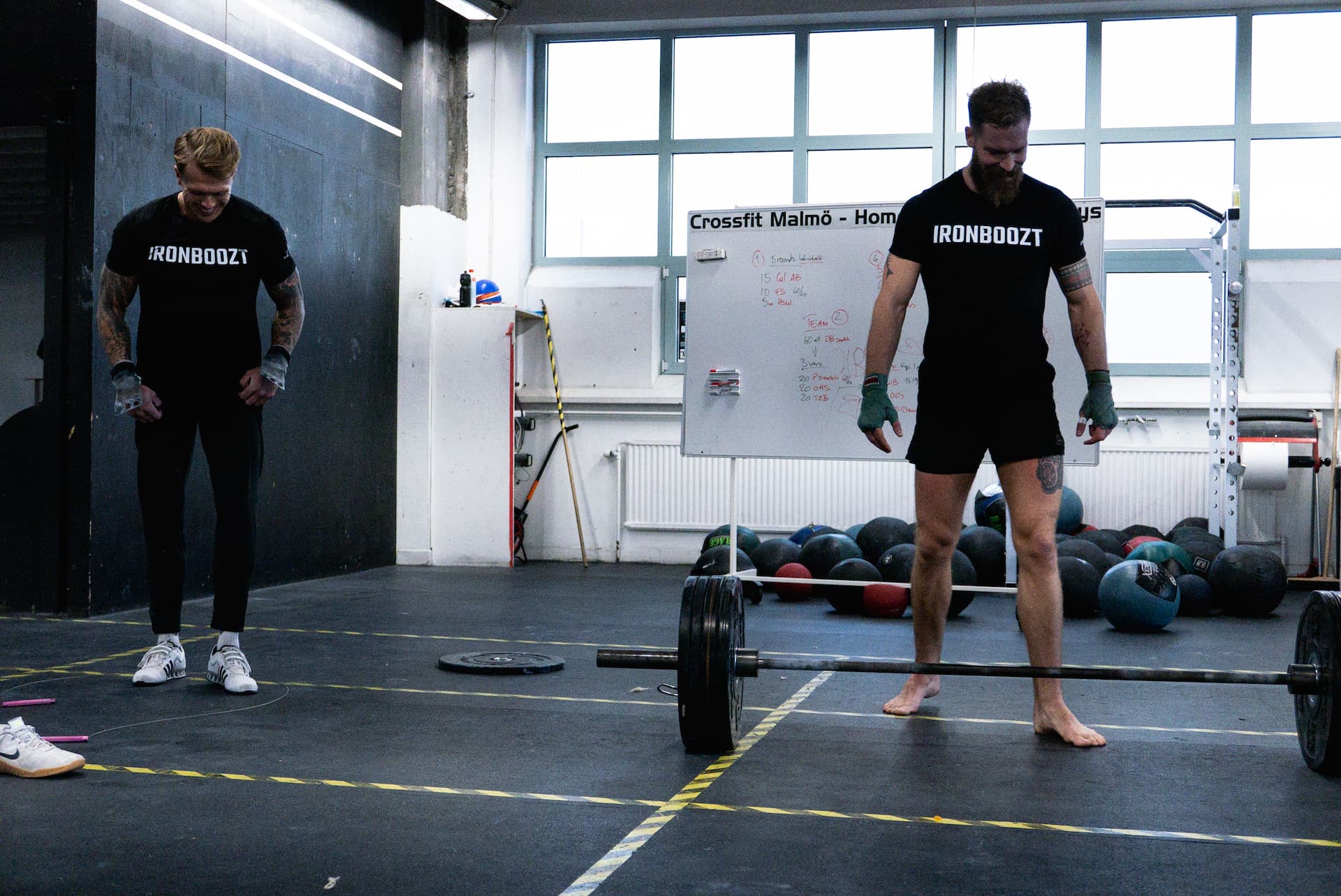
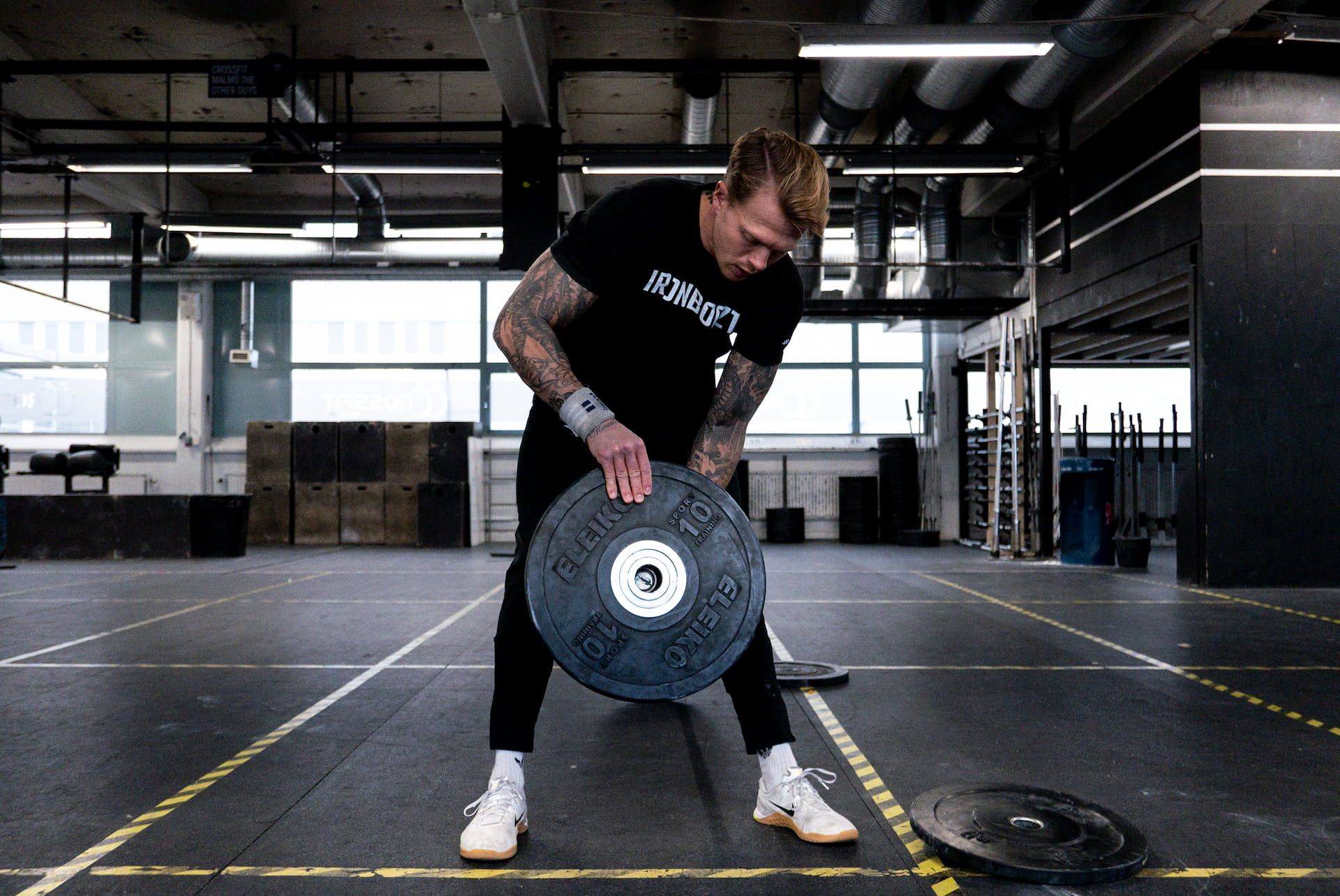
Focused on high-contrast black and white for maximum visibility across dark gym apparel, bright backgrounds, and physical tags.
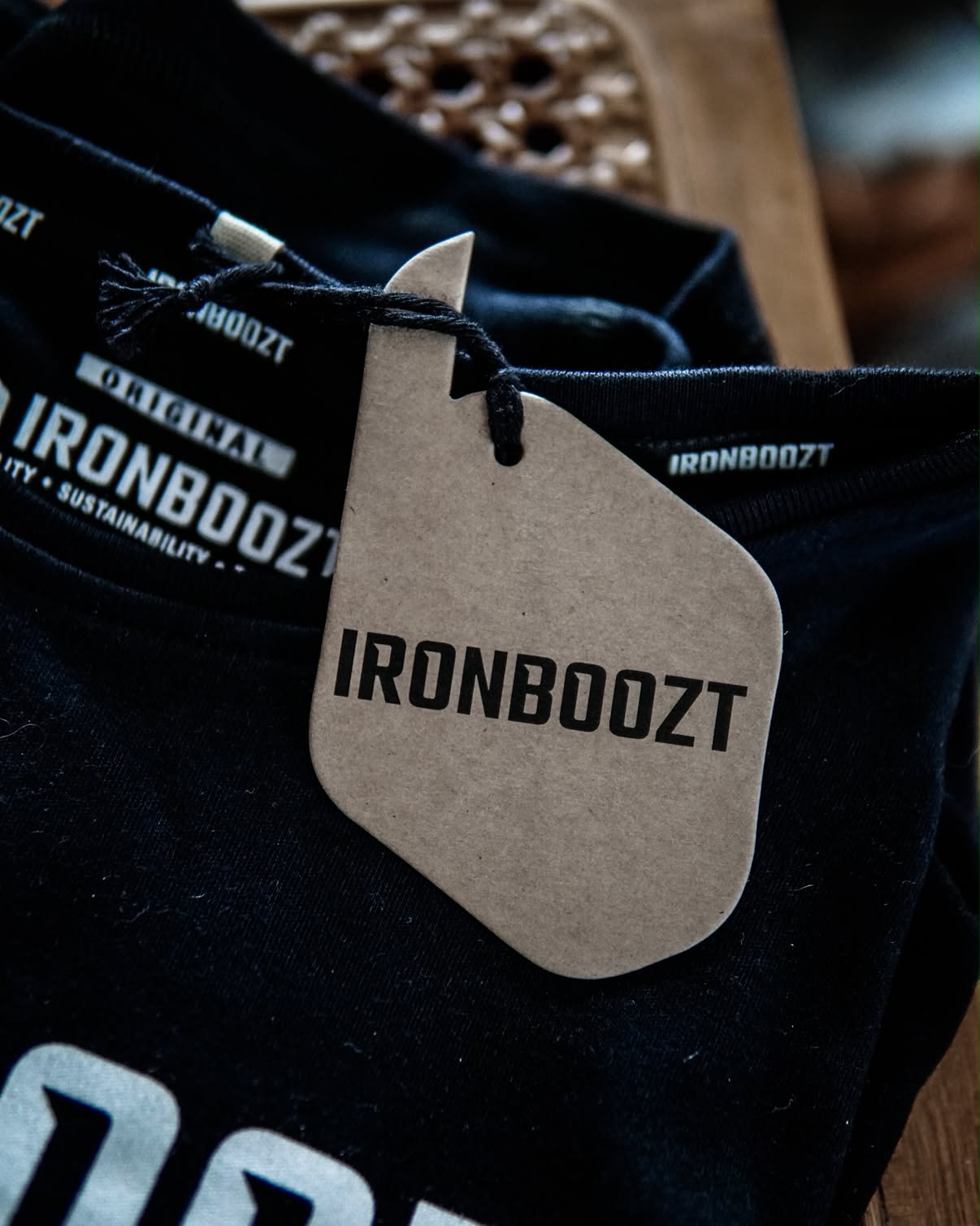
Apparel Tags & Details
Created external clothing labels and product details that complement the premium, eco-friendly feel of the garments.
Key Learning
Designing for physical apparel requires thinking beyond digital screens. By creating a bold, geometric monogram without overly fine details or tiny text, we ensured the identity translates seamlessly across all mediums—staying sharp and legible whether embroidered on heavy fabrics, screen-printed on activewear, or stamped on recycled tags.